The Ultimate Guide to Using Colors in Interior Design
Choosing cohesive colours for your home interior design is important. Learn to create stunning colour schemes, and leverage the psychology of colour.
Have you ever entered a room and felt immediately energized or calmed? it is colours that have such an effect on mood! Colour selection greatly influences how we feel in a given area. This guide explores the world of colour in interior design. We'll go over how to select colours that suit your design and create the ideal mood and ambience.
What is a Colour Scheme?
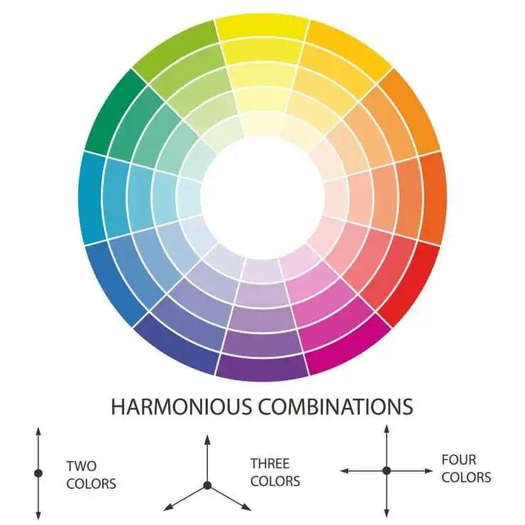
A colour scheme is a collection of hues used in a variety of creative tasks, including fine art, home design, and graphic design. Each colour scheme incorporates one or more of the 12 hues found on the colour wheel. Colour schemes typically involve two or more colours, and they are chosen to create a specific aesthetic effect or feeling.
The main types of colour schemes are:
- Monochromatic colour scheme: It focuses on a single colour and frequently incorporates hue variations through tints, tones, and shades.
- Complementary colour scheme: Complementary colours are opposite one other on a colour wheel. The most common complementary colour combinations are blue and orange, red and green, and yellow and purple.
- Analogous colour scheme: Analogous hues are made up of three colours that border each other on the colour wheel.
- Triadic colour scheme: A triadic colour scheme comprises three hues evenly spaced on the colour wheel, producing a triangle.
- Neutral colour scheme: This popular colour scheme is often made up of achromatic tones (white, grey, and black) and near neutrals (beige, tan, brown, and other dark colours).\
Related: What Is a Colour Scheme for Interior Painting?
The Importance of Colour for Interior Design
Colour is more than simply an aesthetic choice in interior design; it is a powerful tool that influences how we perceive a space.
Setting the Moods
Colours have a wonderful capacity to elicit various emotions and influence our mood. For example, blues and greens are frequently linked with peace, relaxation, and harmony. however, vibrant yellows and oranges may boost energy, enthusiasm, and creativity.
Perception of The Space
Lighter colours make a space feel more open and spacious, whilst darker tones provide a sense of closeness. This may be very effective for changing the apparent size of a room. Designers can control a room's apparent size and proportion by selectively applying colours in different portions of the room or in areas where light falls or shadows occur.
Read also: How to Design Your Dressing Room: Tips and Ideas.
Harmony and Cohesion
Colour may act as a visual signal to connect diverse items, such as furniture, accessories, and architectural characteristics. Designers achieve a sense of harmony and unity by using a constant colour palette, which enhances an overall scheme that does not irritate the senses.
The Key Principles for Choosing Colour Scheme
There are numerous fundamental aspects to consider when selecting a colour scheme for interior design:
Colour Theory
Colour theory is the foundation for the basic laws and standards that govern colour and its use in creating visually appealing images. Understanding the foundations of colour theory allows you to begin to analyze the logical structure of colours on your own to develop and use colour palettes more strategically.
Read also: Basics and Principles of Great Furniture Design.
The 60-30-10 Rule
In the design profession, the 60-30-10 rule is a formula that helps designers choose and combine colours for their projects. Simply put, these guidelines state that the dominant/primary colour should represent 60% of your design, the secondary colour 30%, and the accent colour 10%.
Consider the Space
Lighter colours can brighten a dark room, while darker colours can make a large space feel more intimate. Think about how the room will be used. Energetic colours might be great for a workout room while calming colours suit a bedroom.
Inspiration and Personal Style
You can draw inspiration from nature, art, or your favourite clothing collections. There are no hard and fast regulations. Ultimately, the best colour scheme matches your preferences and produces the desired ambience.
Consider Existing Furniture or Artwork
Furniture or artwork can serve as a starting point for creating your colour palette. Examine the fabric, wood tones, and finishes of your primary furniture pieces. Are any prominent colours present? For example, a brown leather sofa may indicate a warm colour palette with cream or beige accents.
Colour Matching for Different Rooms
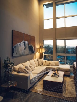
Living Room
The living room serves multiple purposes, including socializing, relaxing, and entertaining. It is the centre of the house, where friends and family come to relax and entertain. Warm and inviting hues, such as creams, beiges, and light browns, may create a pleasant atmosphere. If you want to create a more vibrant and cheerful setting, choose bright colours like orange, red, or yellow.
Bedroom
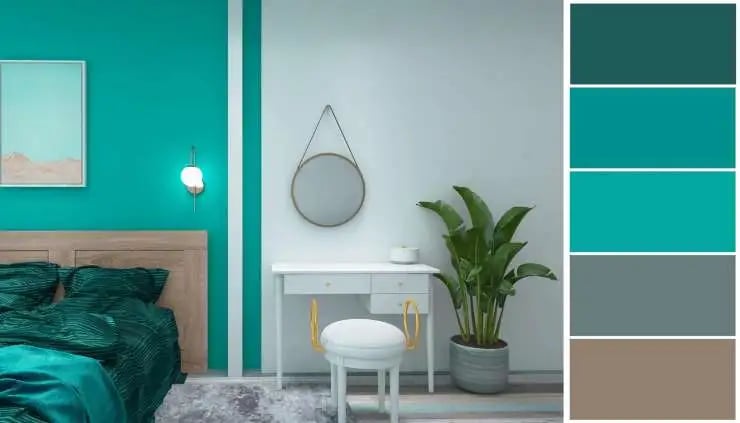
Your bedroom is a place for relaxation and slumber. Peace and serenity are of the highest concern. Soft blues, lavenders, greens, and neutrals are wonderful choices for creating a relaxing ambience. Deep purples, plums, and dark greys may provide a luxury sense.
Kitchen
The kitchen is a functional area for cooking, socializing, and eating. Light yellow, green and blue colours may produce a cheerful atmosphere and are great for cooking. Earthy colours such as terracotta, beige or tan may create a warm and inviting atmosphere that is ideal for family gatherings.
Bathroom
The bathroom is a space for both cleanliness and leisure. Light blues, greens, and greys exude spa-like peace, making them great for creating a relaxing and refreshing ambience.
Kids Room
A child's room is more than simply a place to sleep; it's a haven for creativity, discovery, and play. Choose bright, colourful hues that will pique their interest and imagination. Consider the primary colours (red, yellow, and blue). Bolder colours like turquoise, orange, or purple can be used with soothing neutrals like beige or grey for school-aged children. Remember to consider their favourite colours and hobbies when choosing a colour scheme.
Mimari Expert: Your Guide to Colourful Interiors
Mimari Expert is an interior design and architectural firm headquartered in Istanbul. We have been successful in creating stunning projects for our clients. Whether for commercial or residential projects, we try to give the best services on the market.
Our design team successfully employs colour theory and techniques to blend colours in the appropriate context and create the ideal colour palette for each room and area in a home.
Contact us immediately to live a colourful life.
Some Of Our Works And Case Studies For Clients
Schedule a free consultation
You can get your free consultation by communicating with us.